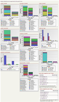
User Adoption Dashboard is live on AppExchange

The User Adoption Dashboard I created earlier this month is now live on the AppExchange. Click the image below to get to the Dashboard page or search for it on AppExchange.
I have received very positive feedback about the dashboard and I understand it is being used by Salesforce.com during AppExchange seminars, which is very nice to hear.
I would really appreciate additional feedback about the dashboard as a comment on this post and/or on the AppExchange page as a review. Also, please let me know how the dashboard can be improved or additional dashboards that would be helpful to have on AppExchange.

Chris Said,
April 18, 2006 @ 7:52 pm
Hi Scott, the UAD is a great timesaver – thanks for providing it! One thing to realize is that the “login” components also count failed logins like incorrect passwords. These can be very significant (hundreds or thousands) if a wireless ISV is failing to log in but keeps trying every 20 minutes, etc. I’ll post this on the AppExchange review as well…
Gareth Davies, CEO Upside Outcomes Said,
April 19, 2006 @ 11:02 am
Hi Scott,
I saw this presented at the recent SF event here in London. It looks really good and just what you need to see who needs a little extra help & support. Great job and thanks for making it available.
I spoke to a company over here who think they may only have a 20-30% log-in rate and are working out what to do about it. I’ll get them to install it straight away and see if they get any more pointers.
All th best
Gareth
Jan Said,
June 9, 2006 @ 5:00 am
Hi Scott,
I adopted your creation and it is a great tool! We use it mainly for a short overview.
What troubles our CEO most is the color changes of each sales member everytime he opens the dashboard. Therefore, he needs more time for realizing which color resp. numbers belong to whom. Is there any possibility to fix it?
Thanks, Jan (from Germany)
Scott Hemmeter Said,
June 9, 2006 @ 8:06 am
Jan – The colors on the graphs are generated by Salesforce.com and the Dashboard functionality does not have the capability of making those colors consistent by rep name. It’s a great suggestion, though. I think that type of functionality would make a wonderful addition to the Dashboards.
However, this is something you’d need to submit to Salesforce.com so they can include it into the application.
I am glad you are finding the User Adoption Dashboard useful.