Archive for July, 2006

AppExchange 2.0

The IT Redux blog has a nice write up on their suggestions for what they call “AppExchange 2.0”. They are mostly suggestions on what should be done to increase the capabilities of the overall Salesforce platform like server-side scripting and a business process manager.

View their blog post

Comments (1) comments feed

MakeTime for Salesforce.com

Company: Aagave LLC (website)
Product: MakeTime for Salesforce.com
App Exchange Page
Demo
3star.png

I had a chance to review a nice little utility called MakeTime for Salesforce.com by Aagave, LLC. It provides a very fast user interface for searching and interacting with your Salesforce.com data. The tool indexes your Salesforce.com database to provide fast searching through an interactive, Java-based UI. Per the website:

You are spending more and more time using Salesforce every day. With ever increasing amount of data at your fingertips, it becomes increasingly harder to find what you are looking for. It feels like you spend more time looking for information, than using it.

MakeTime solves this problem. maketime is a unique, as you type search tool, designed specifically for your Salesforce and Appexchange applications.

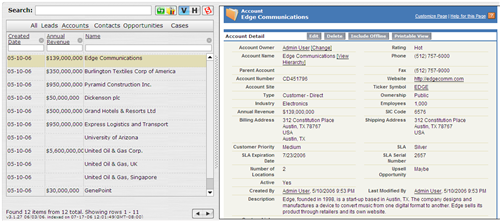
You login to MakeTime here or, if you install it from the AppExchange, you can have it be a custom app/tab in your Org so that authentication occurs through the Salesforce session. When you go in, the MakeTime window will be on the left-hand side of the screen and Salesforce on the right. It will strip out the Salesforce header, footer and sidebar in order to maximize screen real estate on that right-hand side of the screen.

The MakeTime screen allows you to work with All records in the system or to focus on Accounts, Contacts, Leads Opportunities or Cases. In the future, they plan to let you identify the objects you’d like listed on the top or the MakeTime window.
maketime1.png

In the image above, I am looking at Accounts. The first record is active, so that record from Salesforce is appearing on the Salesforce side of the page. Through the setup, I am able to select 5 columns to be listed on the MakeTime window for each object. To search, you can either use the 5 columns you have included or use a keyword search. The keyword search queries across all fields on that object.

maketime2.png

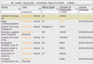
In the example to the right, I changed the columns my session is using and I am looking for customers with over 1000 employees. I typed in my parameters and the results were returned to me almost immediately (as I typed, the results came up). If I highlight a row, that records is displayed on the right-hand side of the screen.

MakeTime supports the most popular browsers: IE, Firefox, Safari and Opera.

MakeTime uses a search library called Lucene, which is an open source product from the Apache Software Foundation. When your company signs up, you need to provide an administrator’s username and password. This is what allows MakeTime to index your data for faster searching. Per the folks at MakeTime, all data is encrypted and the ability to read the Lucene indexes and make any sense of the data would be very difficult. However, your data is still being accessed regularly by a third-party.

Pricing

Pricing for MakeTime is $5/user/month. You have the ability to designate specific end users for sign-up rather than signing up your entire organization.

End users cannot sign-up directly at this time. Because MakeTime needs an administrative password, MakeTime needs to be purchased by those with access to the Salesforce.com administrative side.

MakeTime is not publicly listed on the AppExchange while they work through their data retention policies with Salesforce.com. You have to access their listing directly.

Opinion

MakeTime could work nicely for departments that are constantly in the Salesforce application and need the ability to get to “views” of data quickly where the criteria is changing regularly. A Salesforce.com view can be used for the same purpose, but is slower to create and slower to work with than MakeTime. I can envision MakeTime being used by groups that are responding to leads all day or by support teams that need quick access to the cases they are dealing with.

The user interface is pretty good. I did have some trouble getting my columns setup, sequenced and sized the way I wanted them. However, I was able to do it in a minute or two. The search is not perfect. In the example above, I was originally searching on “Customer – Direct” for the type value, but it interpeted it as Type = “Customer” and Type <> “Direct” because the minus side was there. These are things that should continue to improve over time.

My biggest suggestions for Aagave as they develop this tool are to:

  • Work with Salesforce to get publicly listed on the AppExchange. I am sure that their data policies are safe and secure, but getting this listing from Salesforce makes customers that much more confident.
  • Allow any end-user to sign up without the need for administrators to provide a username and password. This will open up a market for them to sell directly to the end user that is looking for a product like this to help them out and doesn’t need to work through administrators to do so.
  • Allow for more other objects than Leads, Accounts, Contacts, Opportunities and Cases to be listed on the top of the MakeTime window for searching.

It’s worth checking out the demo if you are interested. There is a button on that page to use a demo username and password. I don’t envision every end user having a need for this application. However, teams that “live in Salesforce.com” all day could benefit from MakeTime’s interactivity and, hopefully, save them time, which is the whole purpose of the application.

Comments off comments feed

User Adoption Dashboard v1.01

A very small update was made to the User Adoption Dashboard package (which, I am proud to say, is ranked #6 in the Most Popular list on the main AppExchange page). There is a report there that shows people that have logged in over the past 7 days and another that shows who has not logged in over the past 7 days.

Steve pointed out to me that someone logging in exactly 7 days ago was not appearing on either report. Through this, we discovered that there is a difference between selecting Last 7 Days in the date widget at the top of the report and putting LAST 7 DAYS into your criteria of a report. LAST 7 DAYS starts with yesterday and counts back. The date widget starts with today and counts back. This is contrary to what the Help says about how LAST n DAYS works, but still seems to be the case. Because of this, the not logged in report needed to have its criteria updated to LAST 6 DAYS.

What should you do? You have two options (besides doing nothing):

  1. Replace the package: If you did not customize the package after you installed it, then I would suggest uninstalling the old package and then downloading the new one. The new one is located at the same URL on AppExchange.

    app_exchange_button_detail.gif

  2. Fix the report: Go to the “Users Not Logged in Last 7 Days” report in the “User Adoption Dashboard from AppExchange” report folder. Edit the report criteria and change the existing criteria from LAST 7 DAYS to LAST 6 DAYS.

Comments (1) comments feed

Summer ’06 Release Landing Page

Salesforce has published a landing page for their Summer ’06 release.

http://www.crmsuccess.com/summer06.jsp

This page also has a bunch of presentations on the various pieces of new functionality.

Comments (3) comments feed

BIG Picture for AppExchange

Company: D2Aligned (website)
Product: BIG Picture for AppExchange
App Exchange Page
3star.png

BIG Picture from D2Aligned is a tool that provides you with a single view as to how your business is performing against a set of stated goals. Per the AppExchange listing:

BIG Picture shows how all your mission-critical activities are performing simultaneously toward your strategic goal. This unifying view gives you greater decision-making insight than through salesforce.com dashboards.

It’s a different take on a dashboard concept. Salesforce dashboards are not particularly good at measuring data against goals. Enter BIG Picture.

Functionality

The idea is that you first create a BIG Picture record. Within a BIG Picture are success factors. Each success factor is tied to a specific Salesforce.com report (can also link to a manually entered data source or another BIG Picture). Then you identify what piece of information from the report do you wish to compare to your goal (count, sum, average, minimum, or maximum of a specific field) and then you document the goal itself. You can also do some tweaking of how important each success factor is compared to another by giving each factor a weight. This weight then affects the overall calculation. You continue this process by creating as many factors as you need.

big_picture1.png

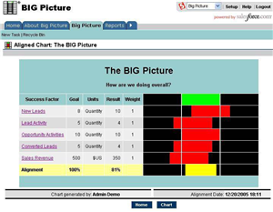
When you click the Calculate/Display button, the BIG Picture success factors are calculated and compared against your goals in an alignment view. This provides a quick view as to how you are doing against your goals and shows your overall alignment for that BIG picture.

You can create as many BIG Pictures as you wish and make them public or private. Public are available to all and Private are only available to the owner. There is no functionality to assign BIG pictures to specific groups at this time. 1 big picture can be identified as the “Shared BIG Picture”. This Shared BIG Picture is available for viewing by all Salesforce users. Click on the success factor in the BIG picture takes you to the Salesforce report.

To see more about the functionality in this product, view their demo.

Pricing

BIG Picture is $10/user/month for people that are manipulating BIG Pictures. The Shared Big Picture is available to all Salesforce.com users without them needing a license.

Opinion

BIG Picture is not a product that makes you say “wow!” upon seeing it. After playing with the functionality for a while, you get to learn how to be creative with it and you will probably start to like it.

BIG picture’s focus on providing a comparison against goals is the key takeaway here. It does this better than Dashboards and it can provide a concise picture of the “big picture”. If your organization is looking for solutions to help provide this level of analytics, BIG Picture is worth a look. A nice thing about it is that you don’t need to license every user in your Org for it. You could license just a few users who are responsible for building the reports and BIG Pictures. They could use the tool to perform the reporting and then pass the information along to executive management.

All in all, it’s worth a look if your company is in need of a tool to compare actuals to goals and view it all in a single “big picture”.

Comments off comments feed

« Previous entries